Design boards:
rationale, research, initial ideas, development, final /production, documentation of screening, eval.
Poster - split screen. Dragging image for poster on photocopier to elongate. Relates to how the stargate scene was generated.
Developing initial ideas
- 4 projections?
- Hall being there to welcome, singing soundtrack in background
- when leaving, high pitch noise and red light
- juice boxes/sandwiches
- projections onto ceiling
- pitch black room, glow in the dark tape
Stream of consciousness:
Robotic lost wild familiar
evolution space human
hal robot feelings bones
nonexistent loss memory
abrupt focused chronological
apes space stargate house baby
choir silence
ange confusion lost
lights out apes space planets technology future colours bland
simplicity confidence
Ideas from stream of consciousness:
Audience: chronological - make everyone go in age order.
Space: everyone spaced out - isolation, complete immersion.
Food: juice box tray and sandwiches from film. No food? Serious director.
Seating: glow in dark tape outlining chairs and floor. Seating in rows to copy iconic scene in film.
Screen: keep it simple. Projections? Using technology?
Venue: darkness. Cover all walls in foil?
Entrance/exit: entrance HAL welcomes everyone ordering people to sit in a certain order. Exit stargate covers all walls as they leave and noise.
Object: a QR code to display something for their phones. Or something like a stress ball they can fiddle with during the film? Plain black ticket, minimal and simple. Loads of prints of maps (scene 48:26) in a zine?
film - product - benefit
Phrases for presentation:
‘we are altering the…’
‘to emphasise a sense of…’
‘by…’
‘we are creating a…’
‘to continue the idea of…’
Potential ideas to be taken forward:
- We are altering the seating to portray the chronological element of the film by getting everyone to sit in chronological order.
- We are taking the food from the film and recreating as the snacks for film.
- Upon entering the screening, Hal will be displayed on screen, welcoming audience to cinema and directing to seats [see idea 1].
- Continuing the simplicity of the film, the screening will have no food or drink, to reduce interruptions.
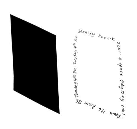
- Taking the nonexistent vibe of the film, the tickets will be completely black. The parallelogram shape would also represent the obelisk.
- When exiting, stargate can be displayed covering the whole room with intense soundtrack.
- We are creating a QR code to continue the idea of technology. Could link to soundtrack, or black screen (!!), or computer malfunction.
Rational for ticket idea: Taking the nonexistent, simplistic vibe of the film, the tickets will be completely black with shiny black print displaying information. The parallelogram shape would also represent the obelisk. The text will follow this shape, also relating to the poster. The red tint of the biro replicates the red rectangle (in scene 39:33) arrival of the business man.
Other ideas from group:
Idea 1
Ticket based on utopian setting of film. Back of ticket - asking how they wold make the screening perfect. Answers could be turned into zine? Creation of logo to make continuity throughout all of screening.
Crit - Idea is effective as a way of getting feedback. Could just be used as information instead of turning into a product. This could be a part of the ticket to rip off so they can keep the ticket.
Idea 2
Hal orders people where to sit. There is a QR code that send your phone to content such as maps or something, or black screen etc.
Crit - making code and getting people to get it could be a risk and not as effective as we want. Hal projection getting people to sit down in certain places could take too long, adding even more time onto an already long film.
Idea 3
Using multiple projectors to display film. Computer malfunction as people come in. Two screens, one the film and one malfunction of both the film. Old TV displaying hal, welcoming people.
Crit - makes film more immersive.
Ticket development
Combining the idea of all black tickets with the ticket design with logo and feedback.
 |
| White on black |
 |
| Black on black |


No comments:
Post a Comment