Collage poster workshop
Own outcomes: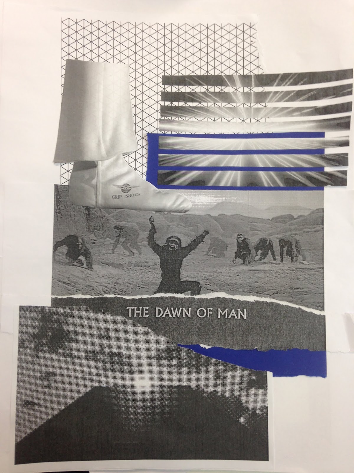 |
| Layering selected scenes |
 |
| Using notable shapes from the movie with different kinds of paper |
 |
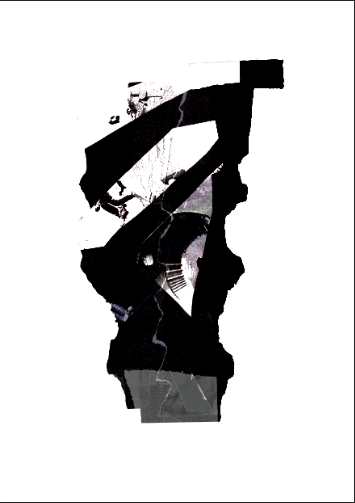
| A key scene of the film embellished with textures and 3D collage. |
 |
| Shapes noted from scenes of the movie, communicating the visual excitement in most known scenes. |
 |
| Cutting the name of the movie to represent the way the movie is put together. Rectangle placement of text resembling the obelisk. |
Other group outcomes:
 |
| Collage of key scenes placed to communicate the way in which each scene links. |
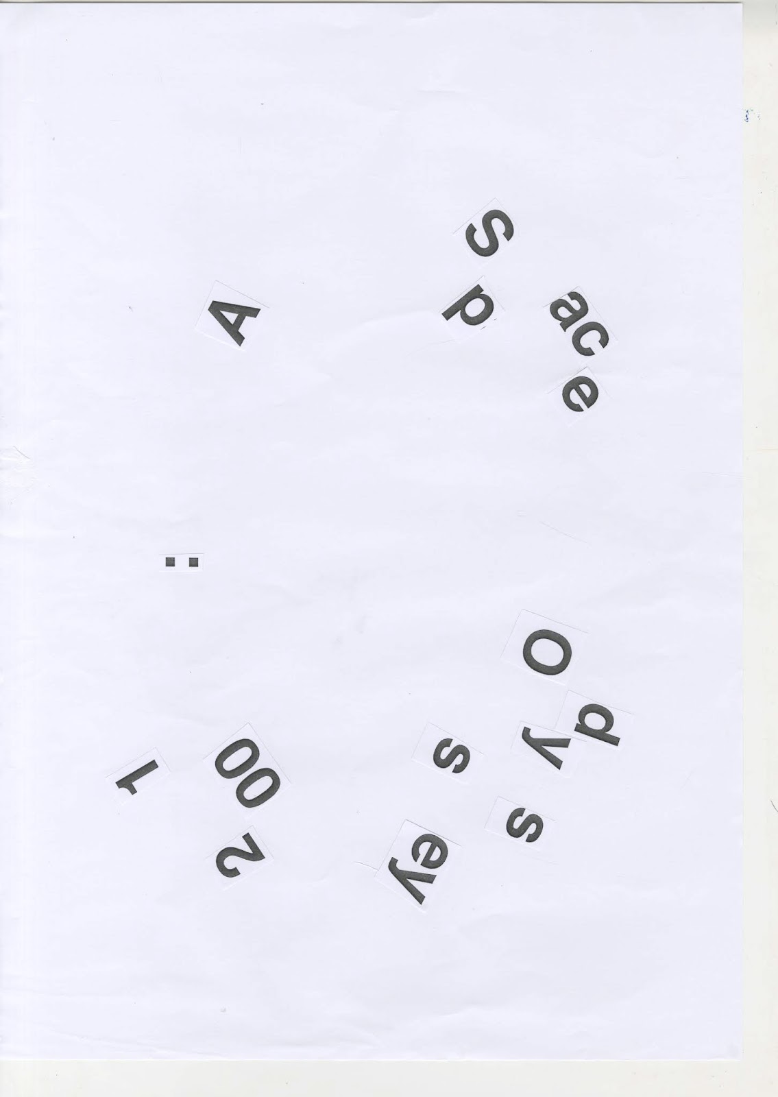 |
| Type placed to resemble space. |
 |
| Cut up imagery to resemble the obelisk. |
 |
| Collage representing a key scene in the book. |
 |
| Simple cut out of the obelisk shape. |
 |
| Represents man running into space. |
 |
| Resembles a key scene within the film. |
 |
| Scene of the film cut into sharp shapes, placed to appear shattered. |
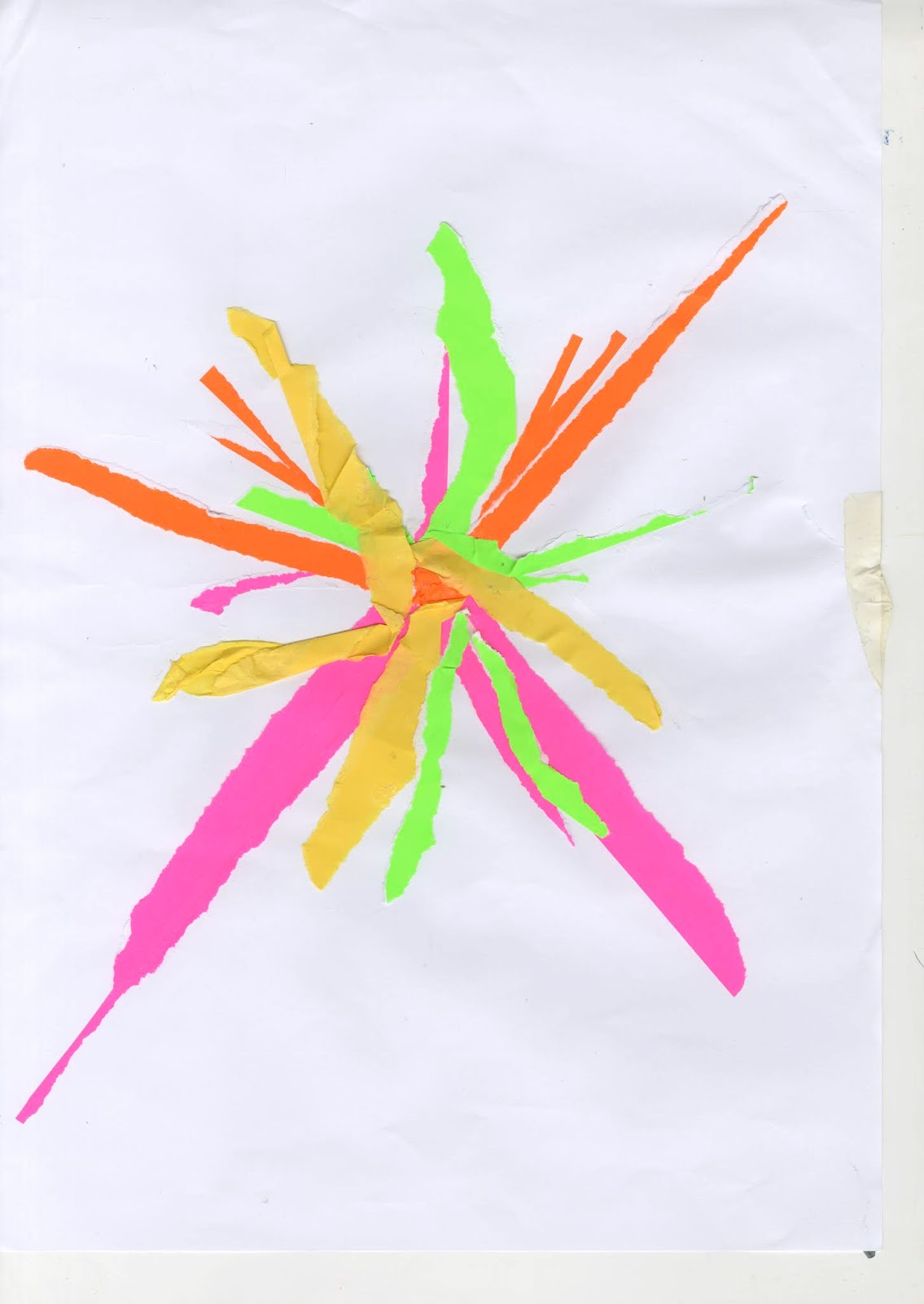 |
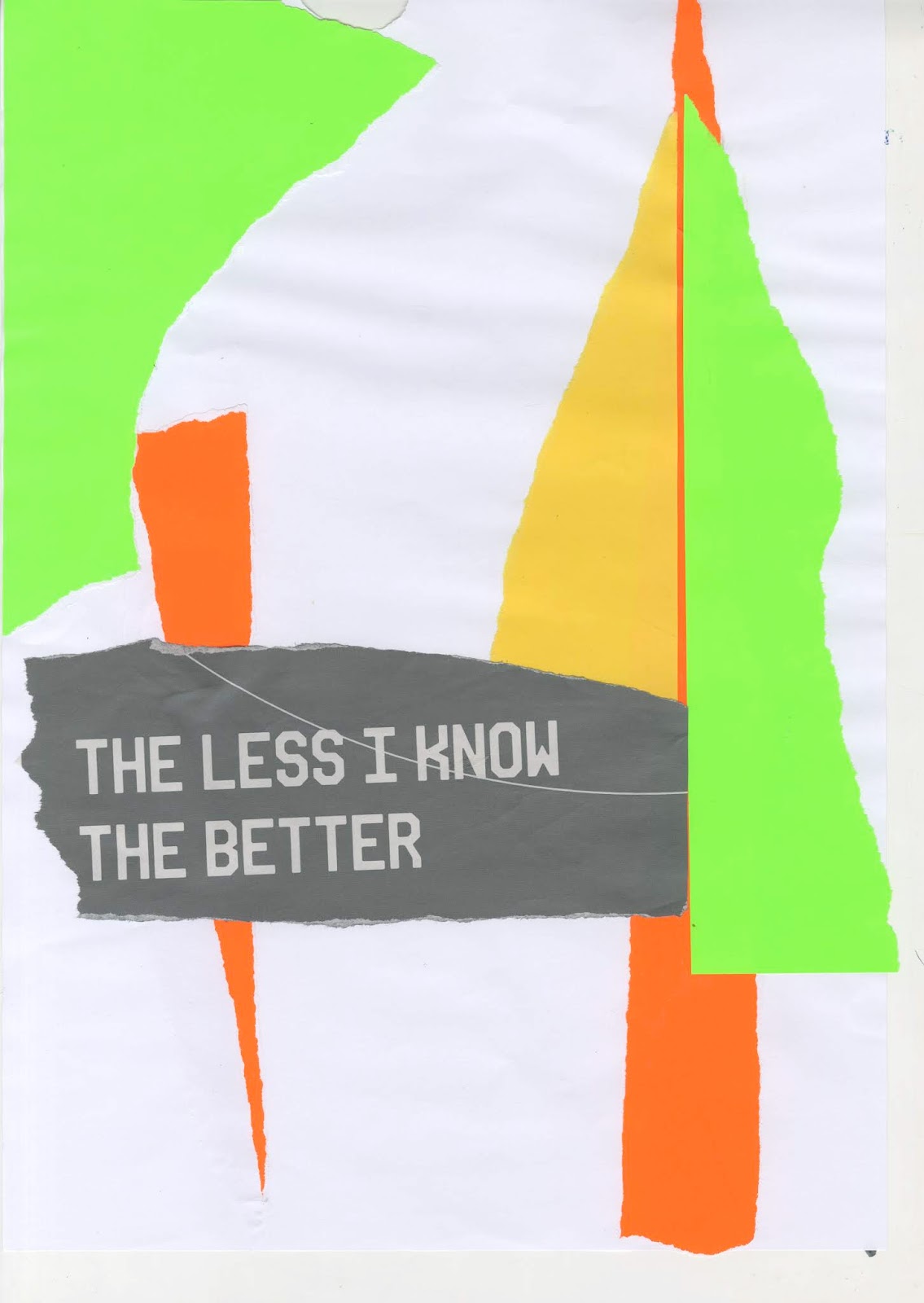
| Bright colours and |


Combining outcomes:
Using collages to overlay imagery and place text for a poster idea.

Combining outcomes using photocopier:


Experiments with placement:


Imagery of poster:


 |
| The chosen imagery for the poster. Resembles important scenes within the film such as the spaceship and the obelisk. |
Placement in poster:
 |
| Placed in the centre of the poster. Issues with this design is that the imagery goes over the type as well as not fitting the whole poster. |
 |
| Stretched using the photocopier, fitting the format of the poster as well as communicating length of time and the obelisk. It also represents the obscure nature of the film. These different posters experiment with placement of the logo, deciding on the logo to be at the top right in order for it to be clear. |
 |
| Colour tests. Colours work well in communicating the bright colours used in important scenes. Black on black works well for consistency with the ticket design, however it isn't legible enough. |
No comments:
Post a Comment